
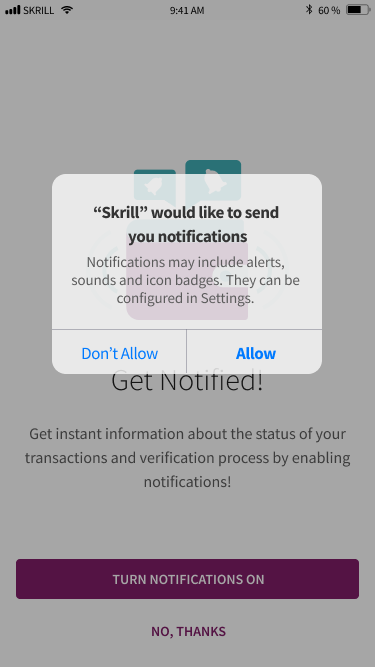
8,301 Total Sign Ups since launch

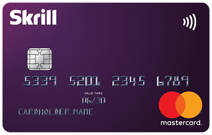
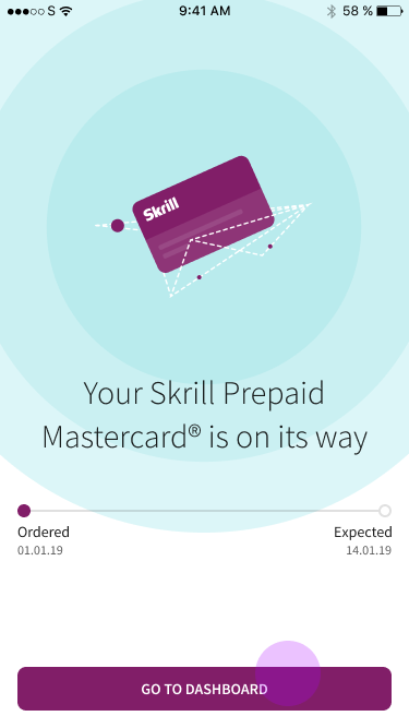
Skrill Prepaid Card
How eliminating one requirement unlocked 25,000 New applications
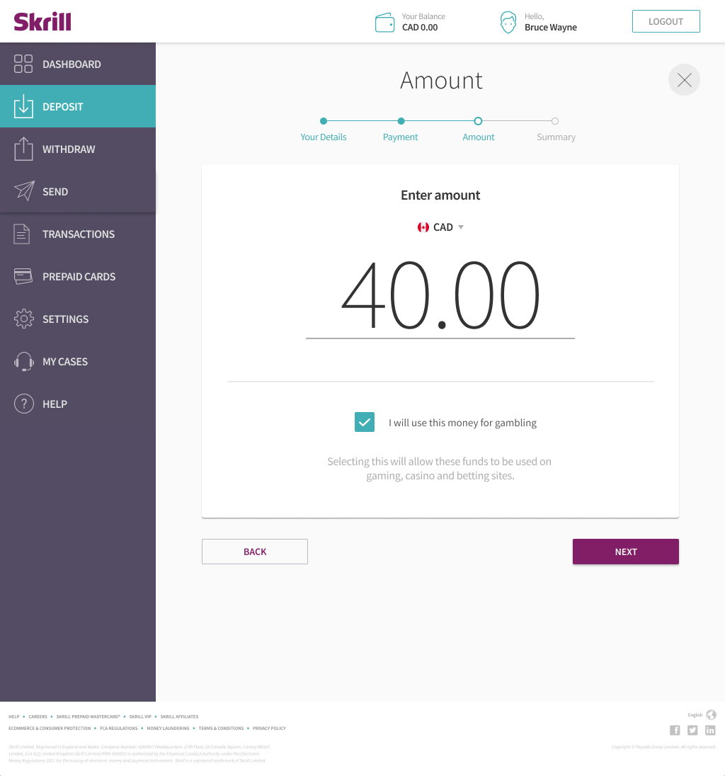
In 30 days, we increased prepaid card applications 519% by removing a single friction point, the initial deposit requirement.
THE CHALLENGE
Fewer steps, more users
The opportunity was clear: many Italian users interested in sports betting needed a secure and accessible payment method that didn't require a traditional bank account. However, there was also a challenge: the mandatory first deposit requirement was hindering new users from getting started.
The project ran on a 30-day timeline during the holiday season, with a company-wide code freeze already in effect. As a Design Lead, I had to coordinate with teams across London, Sofia, Miami, Calgary, and Milan, and multiple functional silos to ship a revamped prepaid card experience by January 6th.
The targets: 25,000 new card applications, 16,000 activations, and a break-even point of 400,000 euros.
Strategy
User-centred design with rapid prototype iteration, tested with users and stakeholders throughout.
Methodology
Product development framed through a Value Proposition Canvas to align user needs with business objectives.UX for Responsive Web and Mobile using Jira · Figma · Illustrator · Photoshop
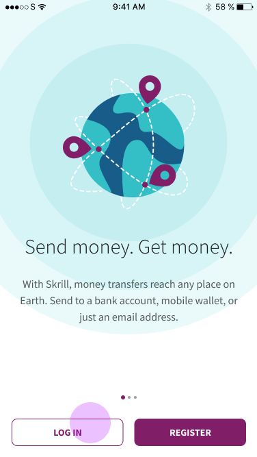
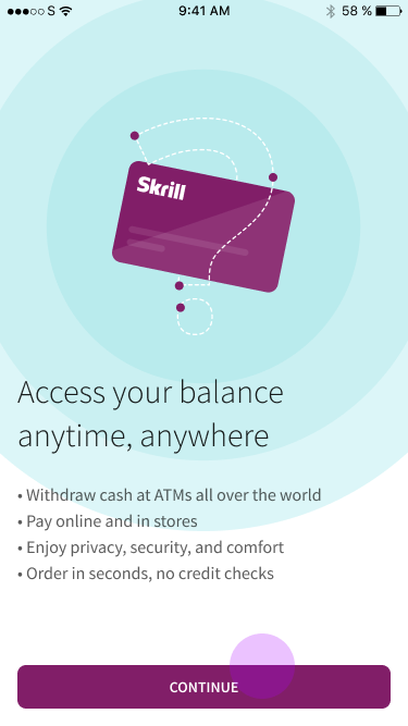
About Skrill Prepaid Cards
The Skrill prepaid card offers a flexible and secure way for users to manage their finances without the need for a traditional bank account.
Functioning as an extension of Skrill's digital wallet, this prepaid card allows users to make online purchases, withdraw cash at ATMs, and pay for services worldwide, directly using the funds in their Skrill account.
It stands out for its convenience, especially for those who engage in international transactions, travel frequently, or prefer a cashless lifestyle.
The card's ease of use, coupled with Skrill's commitment to security and efficient transaction processing, makes it a popular choice among users seeking a reliable, easy-to-control and hassle-free financial tool.
Proposed Value
Growth and Adoption at Scale
The combination of a zero-deposit offer and a streamlined user journey drove over 25,000 new card applications, meeting the original target. Card activations and break-even performance demonstrated that reducing the barrier to entry translated directly into business results.
Giving low-risk users a shortcut
Removing the first deposit requirement made the Skrill prepaid card accessible to a wider audience, particularly users new to digital financial services. The card became a lower-risk entry point, driving broader penetration in a market where cashless alternatives to traditional banking were in demand.
Simpler Onboarding for New Users
Eliminating the upfront deposit reduced the biggest drop-off point in the acquisition funnel. The result was a more direct path from intent to card-in-hand, reducing friction for users who had previously abandoned the process.
User Segmentation
Understanding our users
Skrill's user base isn't monolithic. Analysis of 12-month behavioural data revealed six distinct segments, each with different value and loyalty profiles.
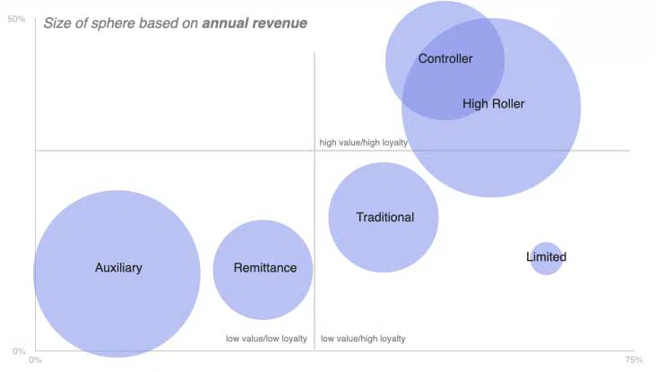
Auxiliary
Low value, low loyalty. These users turn to Skrill as a secondary tool, often to fund sports betting activity separately from their main accounts. In Italy and Spain, sports betting accounted for 58.5% of their transaction revenue.
Remittance
Low-to-mid value, variable loyalty. This group uses Skrill primarily to send money across borders. Loyalty varies depending on exchange rates and competing services.
Traditional
Low value, variable loyalty. A conventional user base carrying out routine financial transactions without deep engagement with Skrill's broader product ecosystem.
Controller
High value, high loyalty. These users consistently engage across Skrill's services and represent the most reliable segment for recurring revenue.
Limited
High value, high loyalty. Individuals conducting significant financial transactions who demonstrate strong platform trust and deep reliance on Skrill's infrastructure.
Key insight
The Auxiliary opportunity
The largest concentration of Auxiliary users was in Italy, Greece, Spain, and Montenegro. Sports betting represented 58.5% of their transaction volume. These users have the potential to become more loyal and increase the wallet's user base.
For users who lacked traditional banking access or who preferred to keep gambling spend separate, Skrill's prepaid card was a natural fit if the entry barriers were removed. Considering the cost of acquiring new customers, Skrill's decision to remove the first-deposit requirement (10 euros) for its prepaid card service in Italy made financial sense.
Typically, the cost of acquiring a new customer, especially in the competitive digital financial services market, can be quite high, encompassing marketing, advertising, operational expenses and KYC validation. In contrast, Skrill found that shipping a new prepaid card to users in Italy was comparatively lower and low risk.
Business Goals
- Increase market penetration in Italy
- Remove first deposit requirement
- Break even at 400,000 euros
- Reach 25,000 new card applications
- Drive 16,000 new card activations
UX Goals
- Streamline the application process by eliminating extra steps and integrating siloed flows.
- Address trust issues caused by the first deposit screen.
- Improve the end-to-end experience across web and mobile.
- Improve NPS score (baseline: 32, September 2019),
Internal Challenges
Mobilizing siloed teams
in record time
The geographical spread of teams — London, Sofia, Miami, Calgary, Milan — across different time zones made collaboration difficult from day one. Marketing, product, legal, and UX were each operating independently, with no shared view of the end-to-end user journey. Add a company-wide code freeze and a hard holiday deadline, and the conditions were about as constrained as they get

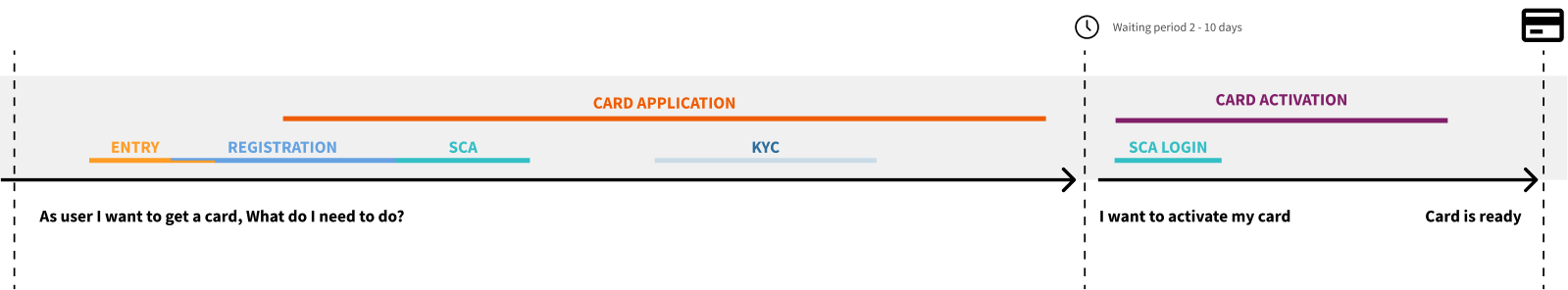
The first step was establishing a shared understanding. No one in the organization had mapped the full journey from new user registration through to physical card activation. We did that mapping first, which quickly surfaced where the biggest problems were.
UX Design
Redesigning the journey from the ground up
Removing the first deposit requirement
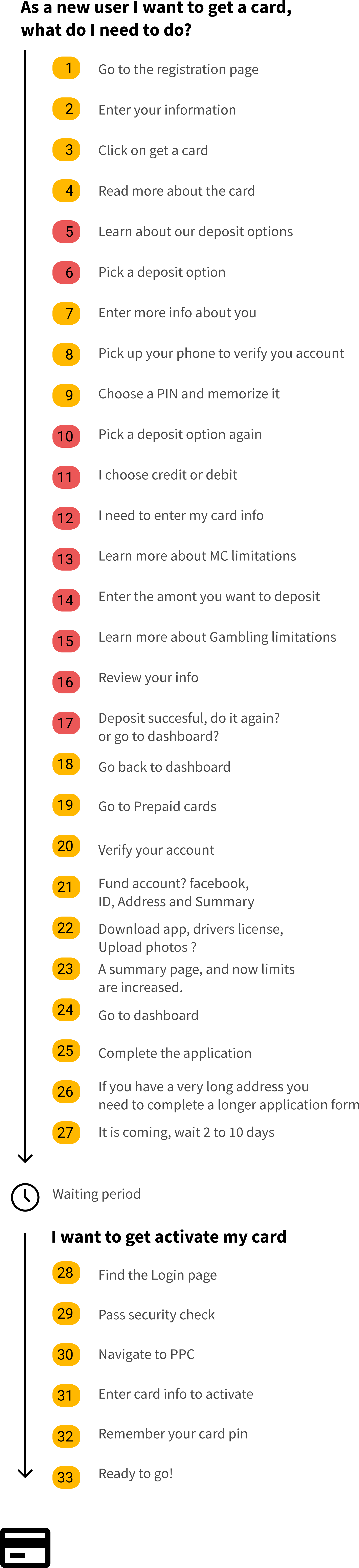
The original flow required new users to make a deposit before they could apply for a card a 33-step process that no single team owned end-to-end.
After removing the first deposit screen and conducting a full task analysis, we identified the redundant steps: unnecessary navigation loops, repeated data entry, and confirmation screens that added friction without adding value.
Streamlining these reduced the flow by approximately 30%.
This analysis involved carefully tracing user steps, which revealed unnecessary navigational complexity and repetitive actions while accounting for potential variations and inconsistencies across the flow.
For many product owners and teams, this was the first time they has seen a new card application for a new user end-to-end.
Task analysis
The Process: Before and After
The original flow:
33 steps across the card application and activation, with the deposit screen creating a mandatory detour before users could progress.
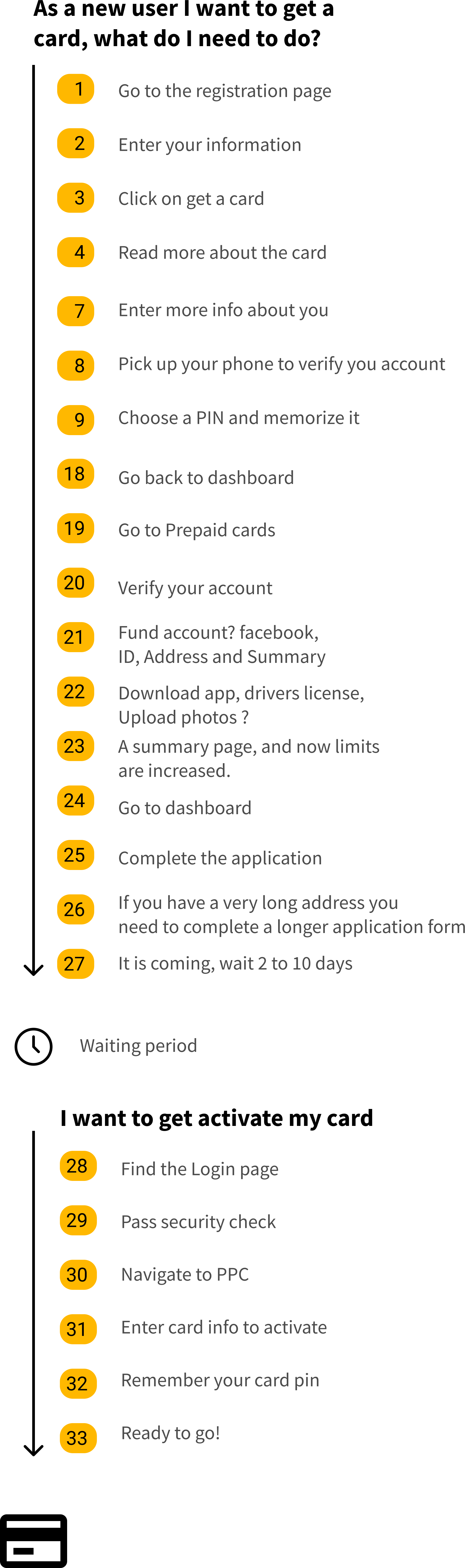
The proposed flow:
Steps marked in red were eliminated or consolidated, compressing the journey significantly while preserving all security requirements (SCA and KYC remained untouched).
Before
After
Worklflows
Redesigned web flow
To remove the first-deposit screen and conduct a full task analysis, we identified the redundant steps: unnecessary navigation loops, repeated data entry, and confirmation screens that added friction without adding value.
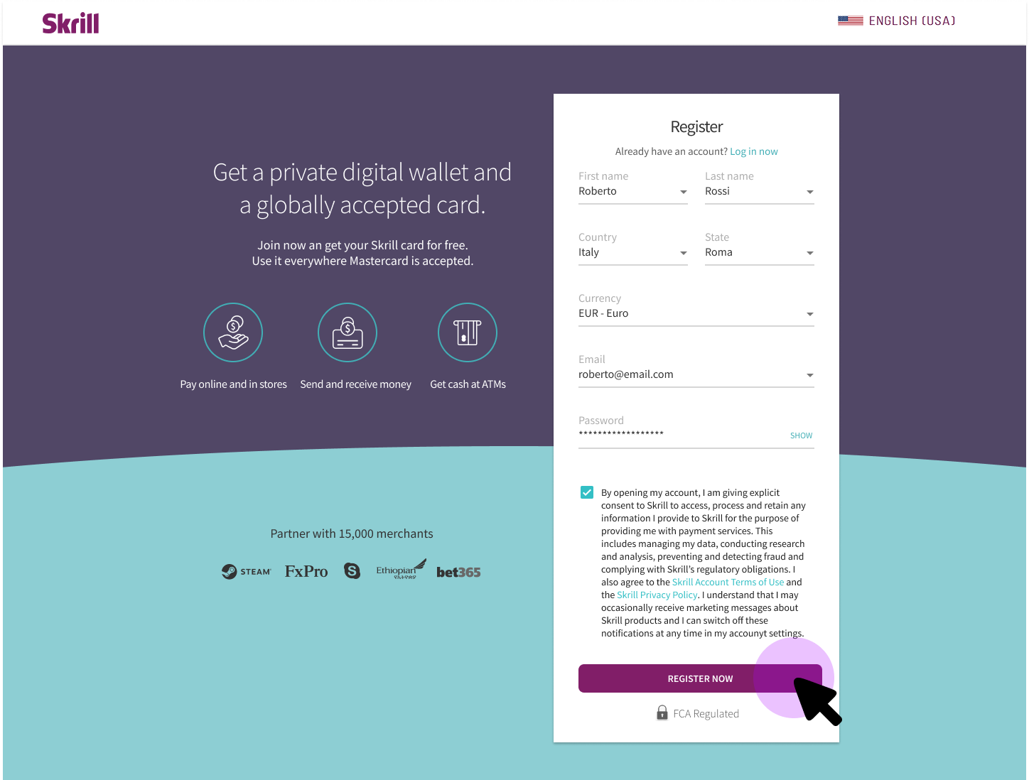
From Registration to Card Order
At this stage, we worked on improving UX copywriting and integrating marketing requirements like graphics, banners, and persuasive copy. This resulted in a seamless flow, enhancing user engagement and coherence between visual appeal and textual clarity, thus aligning the user experience with Skrill's brand identity.
This part was especially challenging since the team did not finalize the graphics, video and assets until a few days before the launch of the TV ad, so we had to work with placeholders and adjust as we received more updates.
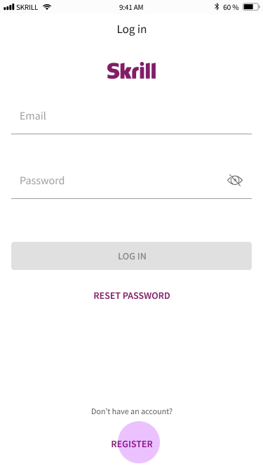
1. Landing page
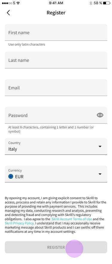
2. Registration

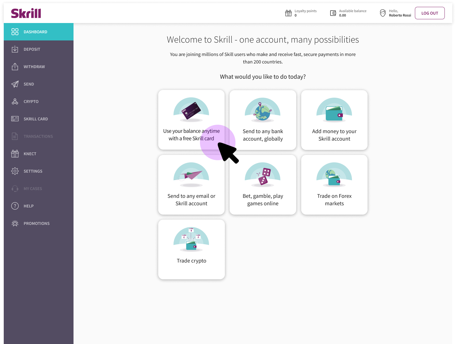
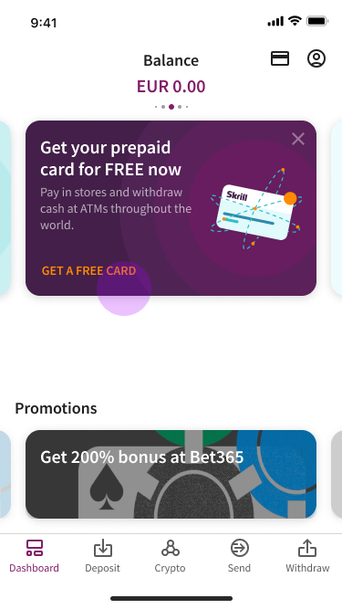
3. Onboarding Dashboard
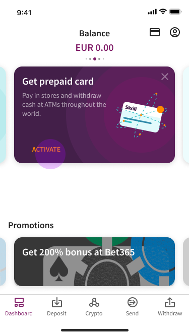
This page helps users understand the main activities offered by the digital wallet, allowing them to explore the features that interest them most. For Italian users, cards have become the primary option. Users can discover the various activities available in the digital wallet to find what they find most appealing.
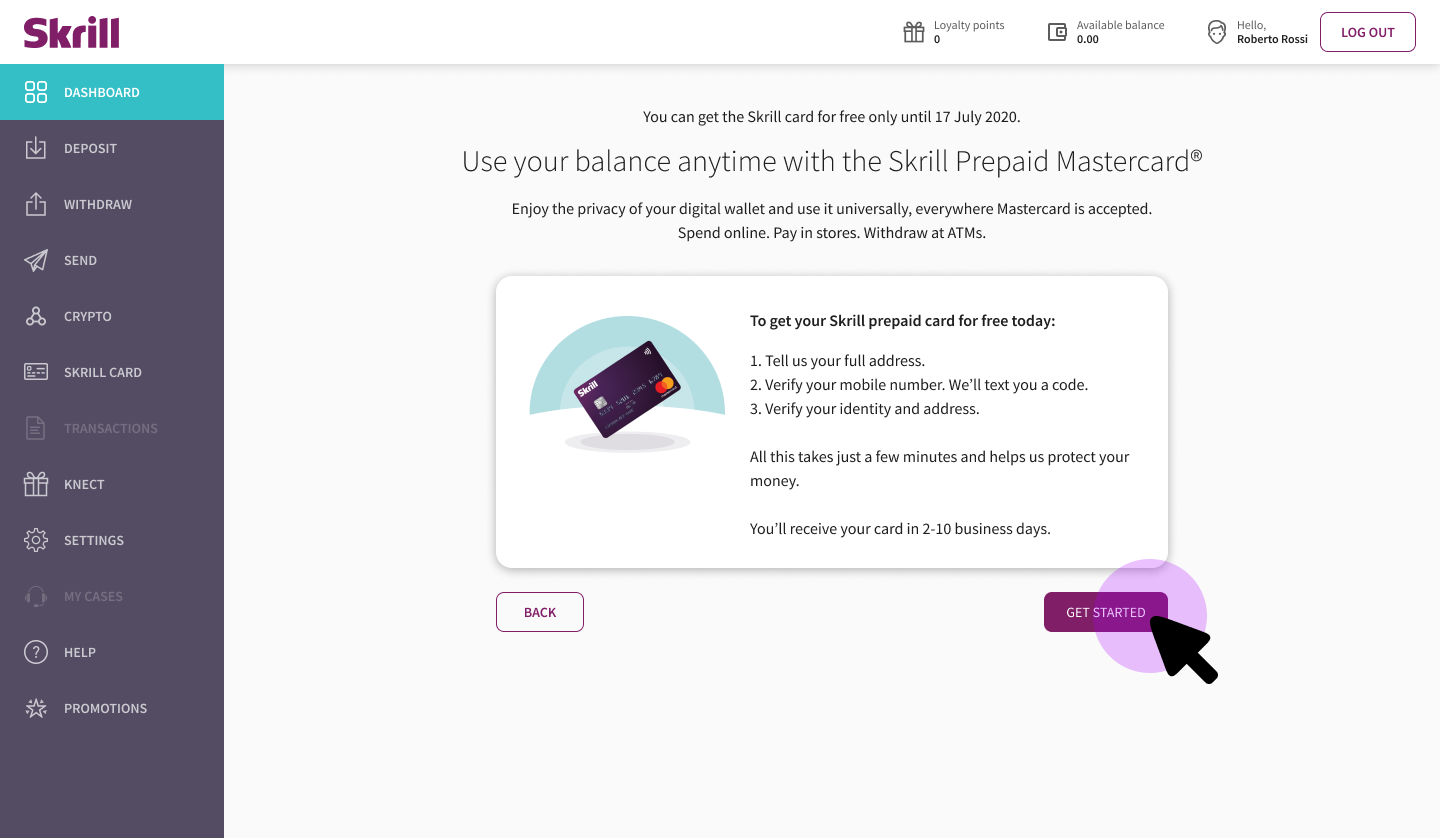
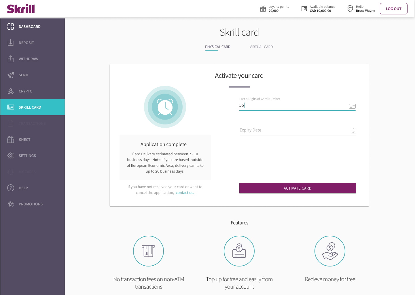
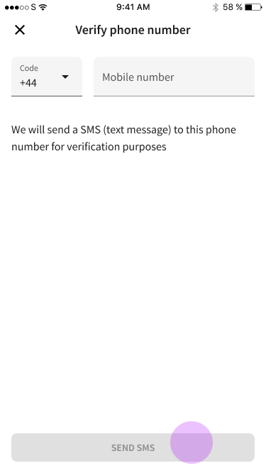
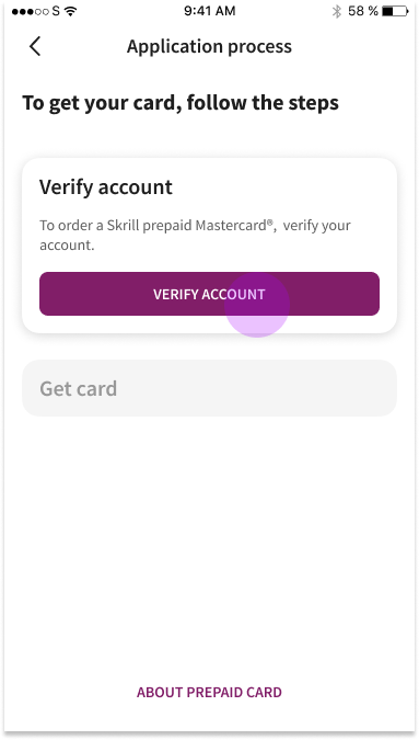
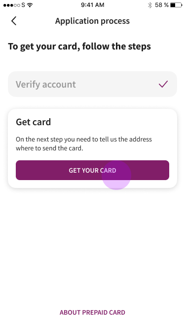
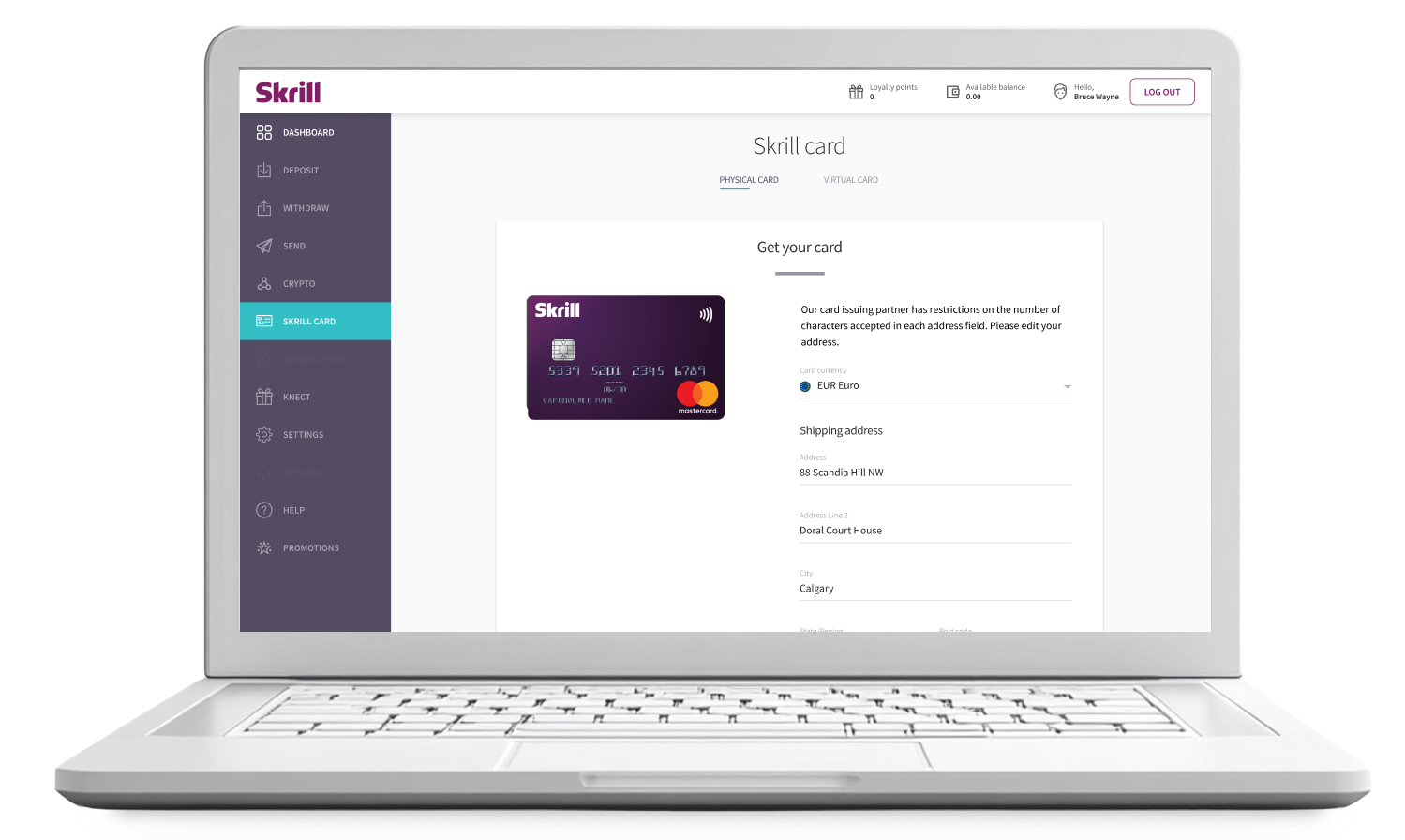
4. Start Card Order
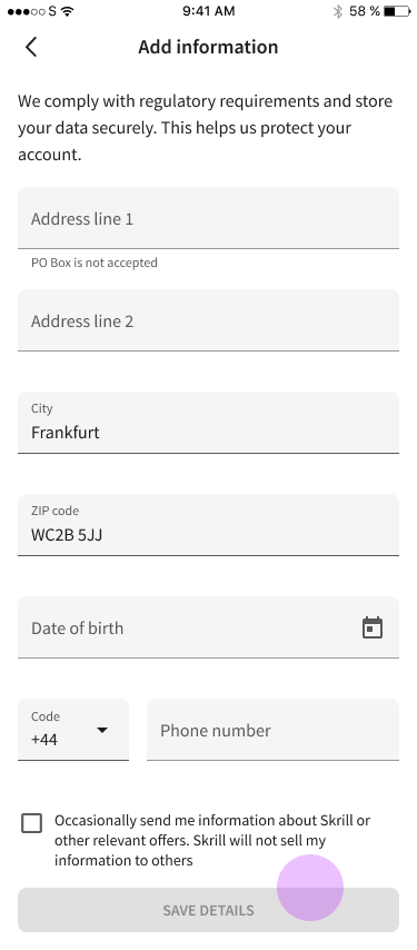
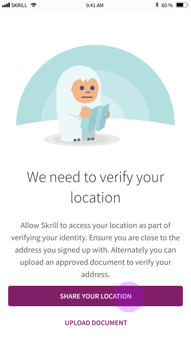
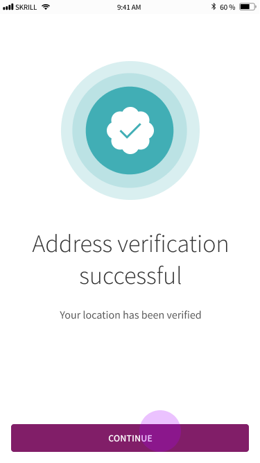
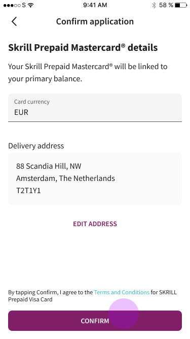
A friction point for many users was providing their addresses, so we needed to provide reasons for them to disclose it, like social approval, backed by Mastercard and its benefits.
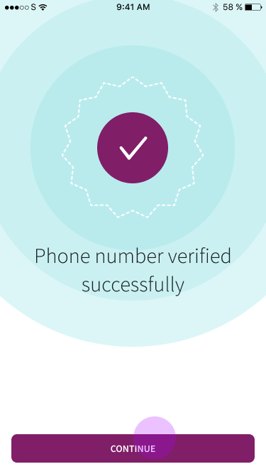
After SCA and KYC are complete, users land on the dashboard with a contextual marketing banner prompting them to continue their card application, a pragmatic solution given the code freeze constraints.
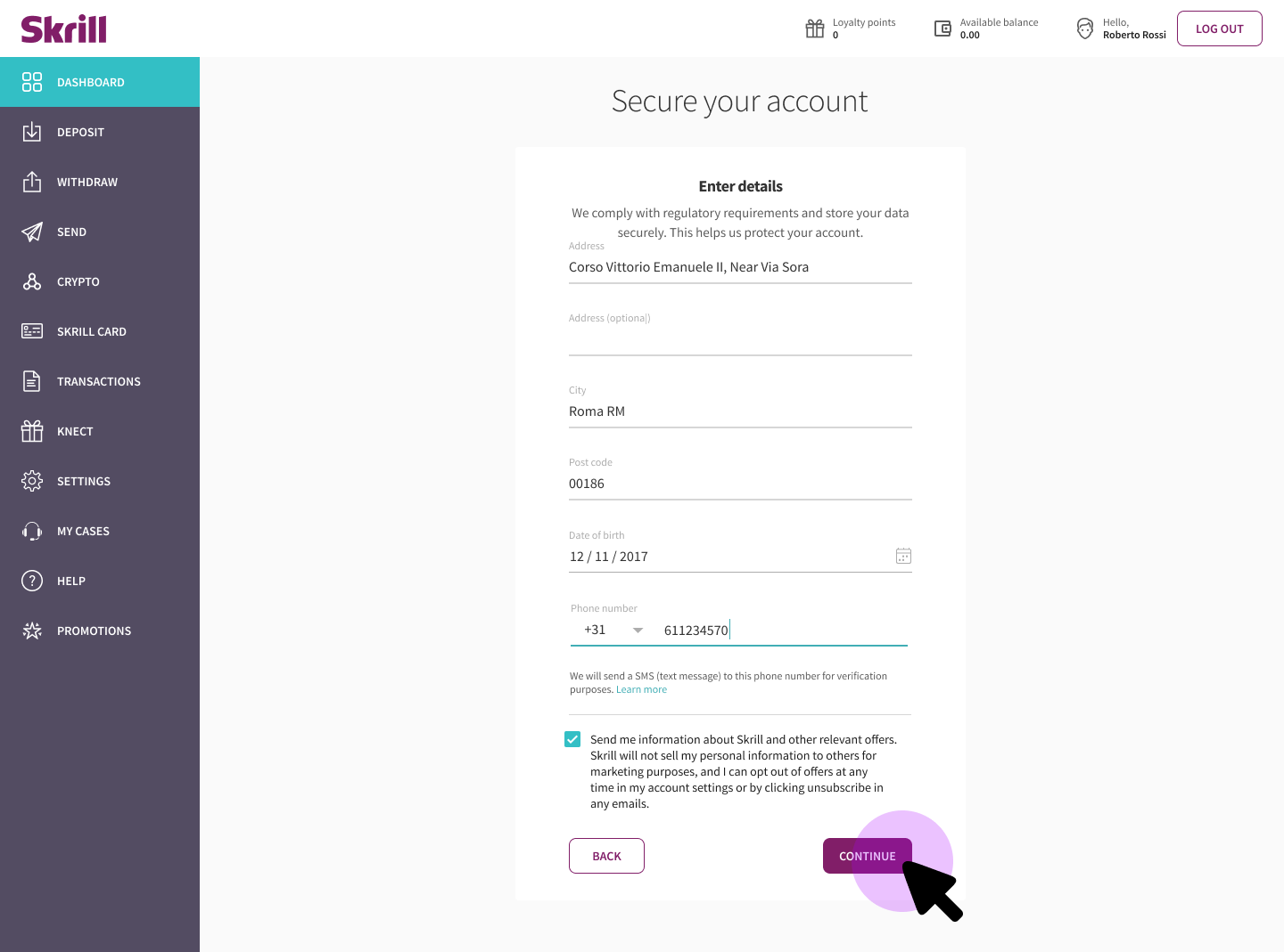
5. Securing Account (SCA)

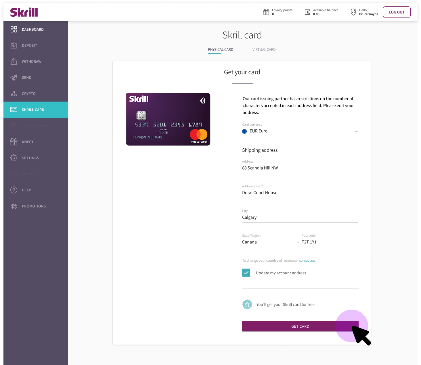
6. If shipping address was too long...
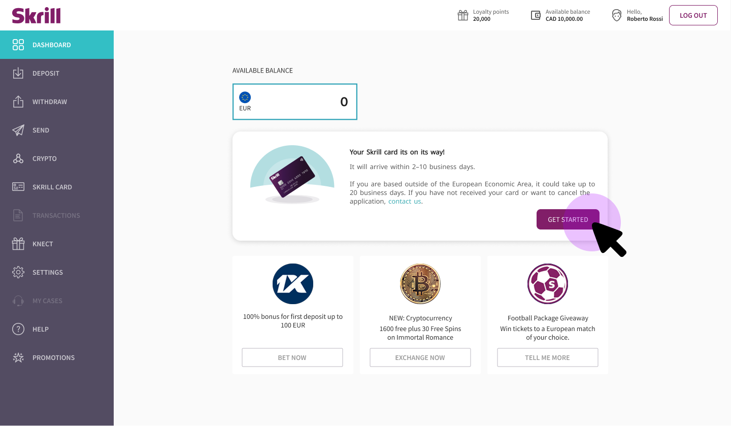
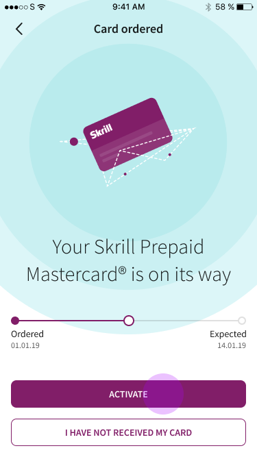
7. Card is ordered and waiting for activation.
Once a physical card is shipped (7–10 business days), users return to activate it. In the meantime, virtual prepaid cards are available immediately.
By the time the card arrived, the user needed to activate the physical card by following the instructions with the physical card.
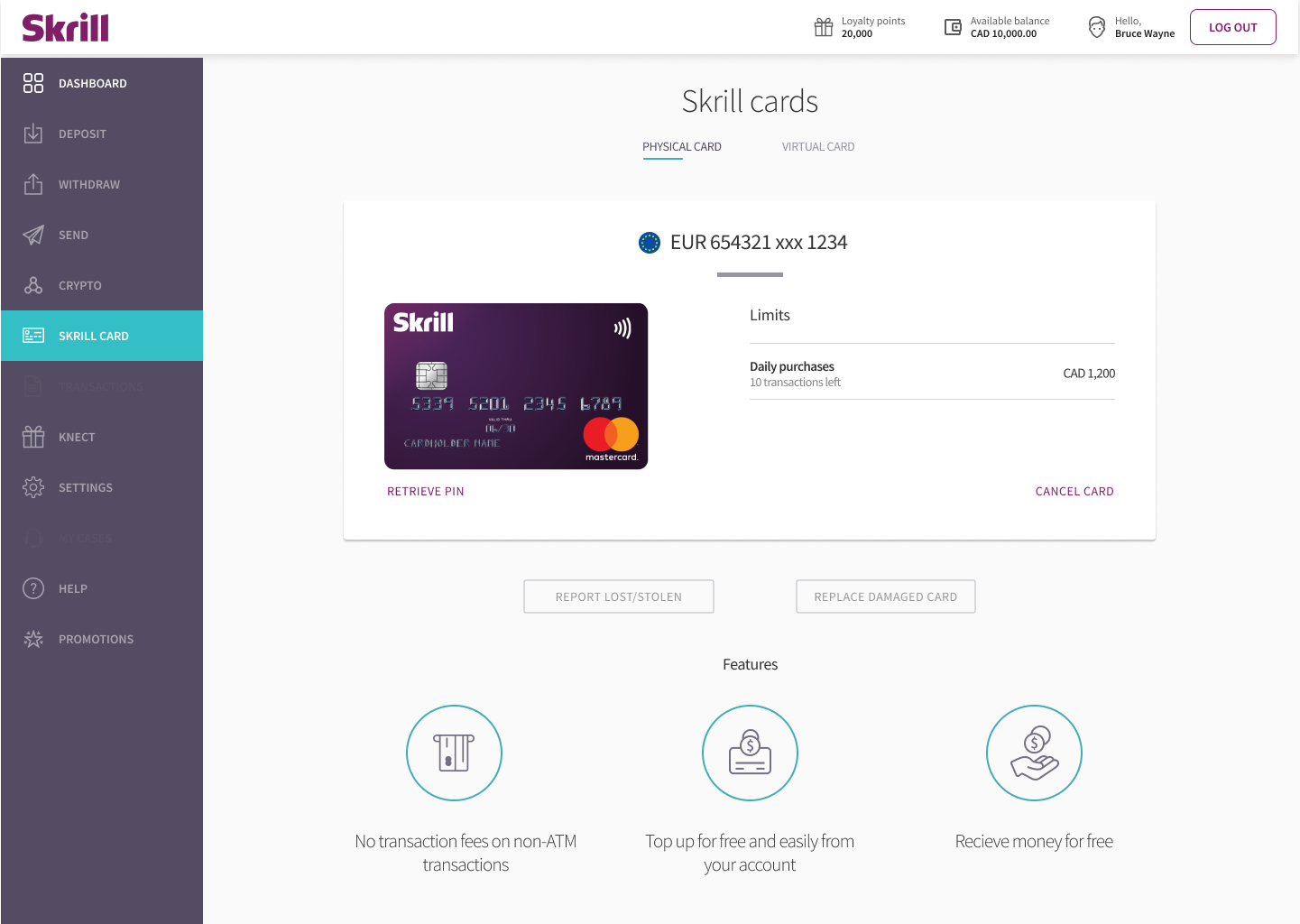
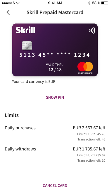
8. Dashboard after card order
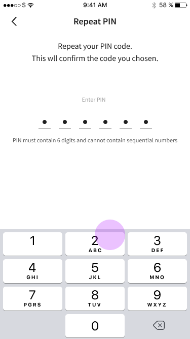
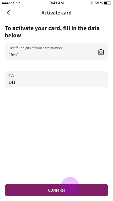
9. Card Activation
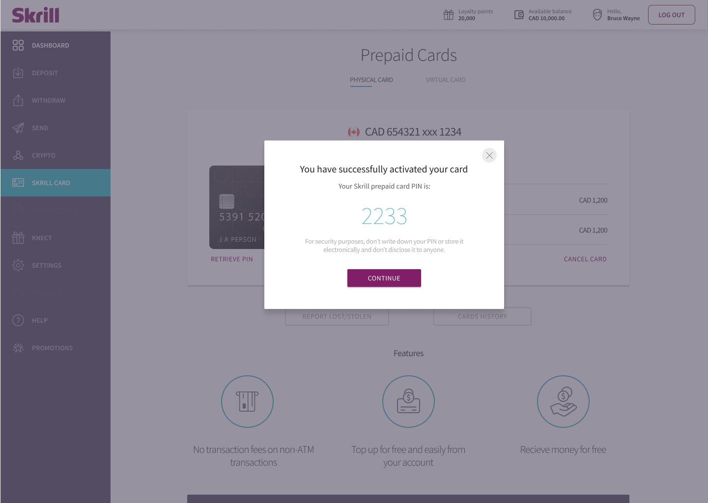
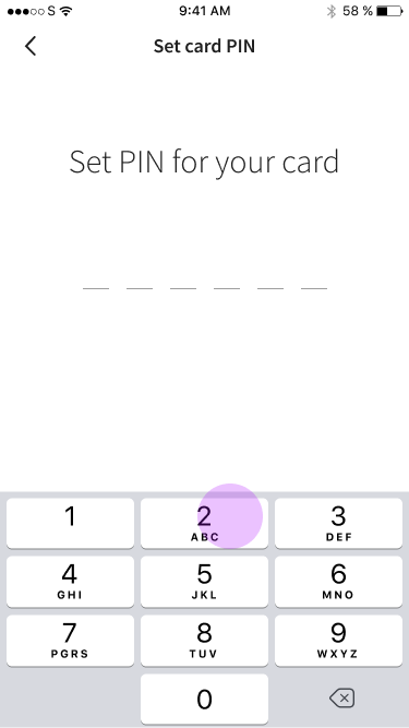
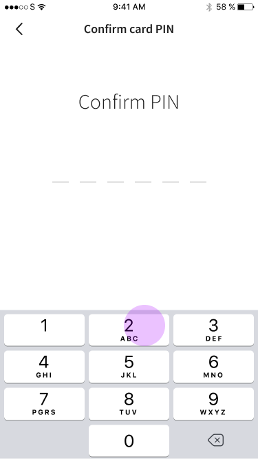
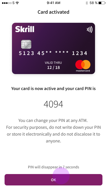
10. Card temporal PIN is displayed
11. Card is active and ready to use

Worklflows
Mobile Interface Design
Adapting the mobile journey required more than just resizing. Touch targets, input flows, and the hierarchy of information on each screen were reevaluated to align with how users interact with their phones in real-world contexts, rather than simply scaling down desktop screens.
The mobile registration and card application flow was prototyped, tested, and refined to match the simplified web flow, with SCA and KYC managed through the Jumio integration.
Registration Flow
The mobile app flow assumed that the user downloaded the app after watching the TV add, so it needed to breakdown the complexity of user onboarding in multiple screens.
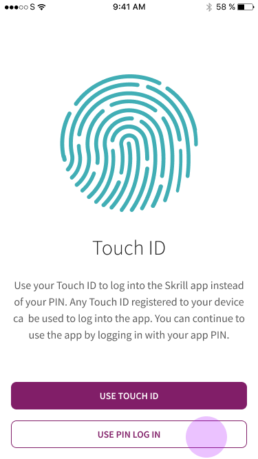
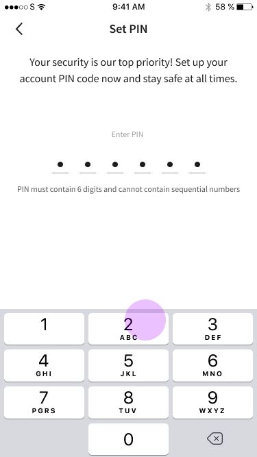
The user can choose between setting up a wallet PIN or Touch ID.
The mobile registration and card application flow was prototyped, tested, and refined to match the simplified web flow, with SCA and KYC managed through the Jumio integration.
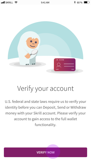
User verfication was not possible to customize for Italy on time, so we still needed to verify the account to be compliant with U.S. federal and state laws (California). Which were much more strict at the moment.
Another aspect we could not work at the time was unifiying the card PIN creation on Mobile and Desktop. The Desktop app did not allow the user to select a card PIN. Forcing the user to remember it, which caused many issues down the road, since users forget their PIN, write them down in unsafe places or confused the card PIN with the wallet PIN.
Activation Flow
Once the card was received, the user needed to log in and activate its physical card.
Final Result
Testing and Translation
A key challenge in developing multi-language interfaces is accommodating Italian translations, which may require 20% to 30% more space than English. It is also important to verify that interface elements remain functional after text replacement and to ensure clear communication with users.
Registration in Italian
VS Card Activation in English
Mobile flow in Italian
Marketing Campaign
Integrating the campaign
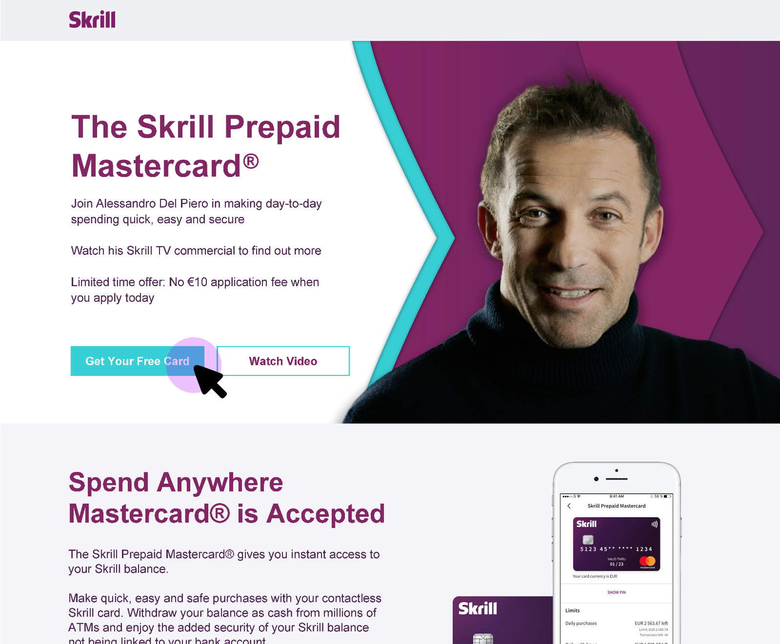
The launch campaign featured Italian football icon Alessandro Del Piero, aired on Sky Sport Italia. The creative concept leaned into Del Piero's iconic number 10, reframing it as the 10-euro application fee that was now waived. The campaign ran for a limited time, driving awareness of the free card offer among Skrill's core Italian audience.
Skrill CEO Lorenzo Pellegrino cited the Del Piero partnership as a centrepiece of the 2020 marketing strategy, positioning the prepaid card as the accessible, modern alternative to traditional banking for everyday transactions and sports betting.
Results
Tracking the results
Tracking the success of Skrill's prepaid card launch was crucial, as it provided valuable insights into user behaviour and the efficacy of changes made and guided future enhancements and marketing strategies.
The launch met its primary acquisition target. Over 25,000 new card applications were submitted following the campaign — validating both the removal of the deposit requirement and the simplified onboarding experience.
Ongoing tracking focused on monitoring application completion rates, activation rates, and NPS progression from 32(good) to 52(excellent). The data-informed subsequent iterations and guided expansion planning into additional low-risk markets.
It was expected to provide an ROI of 369K to 738K euros, with an ARPU ranging between 25 to 50 euros. Requiring 400K euros to break even, 25K card applications and 16K activations to achieve our goals.
Overall results - YoY Uplift - January 24th to 30th, 2020
Prepaid card page KPIs on Skrill Wallet
Trends over time
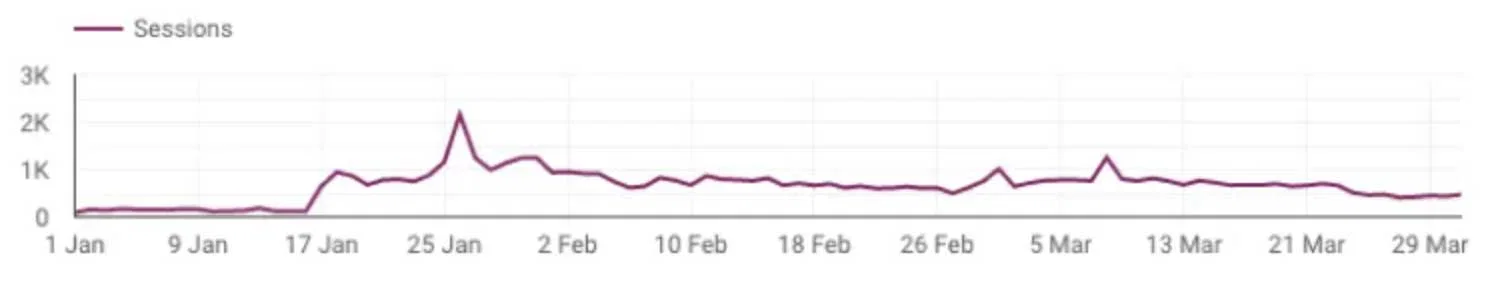
The campaign helped to attract and maintain interest in the Prepaid Card Products over the months. It was increasing unique sessions and keeping a reasonably healthy consumer base until COVID shot-downs started to impact consumer trends, cancelling sports events and economic downturns.
The removal of the first deposit requirement was successful it was implemented in more low-risk countries.
Design Thinking in Action
Lessons learned under pressure
What worked
Mapping the end-to-end journey before touching any screens was the single most valuable thing we did. It created a shared reference point across siloed teams and made it impossible to ignore the 33-step problem. User-centred prioritization, backed by behavioural data, rather than assumptions, kept the project focused when scope pressure was high.
What was harder than expected
The task proved to be more challenging than anticipated due to the need for cross-functional alignment across five cities and multiple time zones during a code freeze. This situation required constant communication and flexibility. Some improvements had to be postponed because of technical limitations; for example, we opted for a dashboard redirect instead of a direct handoff to the card page as a compromise.
Additionally, the teams responsible for mobile and desktop responsive experiences were different, and it took considerable time to persuade them to make concessions. This was necessary to provide users with a more unified experience.
What I'd do differently
Given more runway, I would have invested earlier in shared journey documentation accessible to all teams, not just UX. The lack of an existing end-to-end map was a symptom of structural silos, and surfacing that earlier could have accelerated alignment. I'd also push for post-launch NPS measurement with a defined cadence, rather than leaving it as a planned metric.
Let's work together
What is your next
product?
challenge?
goal?
mission?
product?
challenge?
goal?
mission?
I'm open to collaborations, consulting engagements, speaking invitations, and mentorship conversations. Happy to sign an NDA before we even start.
Work
Fintech & Marketing
Innovation & IoT
Engineering & Energy
Community
©2026 Berumen Design. All rights reserved.