
Democratizing Network Performance Analysis Through Accessible IoT Tools
User Experience for IoT and Mobile App
By combining real-time network intelligence with hardware that anyone could carry and operate, the platform became a leader in mobile analytics, delivering insights across RF performance, customer experience, and business intelligence in a single integrated system.
The Challenge
Carriers had no affordable, accessible way to measure real-world network performance.
MyMobileCoverage set out to solve a problem most carriers didn't even know how to measure: the gap between what their coverage maps promised and what customers actually experienced. By combining real-time network intelligence with hardware that anyone could carry and operate, the platform became a leader in mobile analytics, delivering insights across RF performance, customer experience, and business intelligence in a single integrated system.
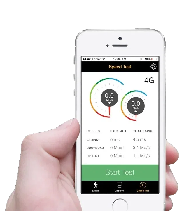
In 2013, MyMobileCoverage developed a low-cost benchmark box that collected essential data on RF environment, network performance, and GPS positioning. It could simulate multiple devices simultaneously and became the foundation for a comprehensive network monitoring platform.
As Design Lead, I brought together Industrial Design and User Experience expertise to guide a cross-functional Scrum team in building solutions that were both technically advanced and genuinely usable across a broad range of users and a tightly integrated product ecosystem.
Role
User Experience Lead, Agile team.
Strategy
Design Thinking & Product Strategy.
Methodology
Product development framed through a Value Proposition Canvas to align user needs with business objectives.UX Lead in Scrum team using Adobe Creative Cloud, SolidWorks ·
Strategy
The get well plan
Early user research and stakeholder interviews revealed four persistent paradigms holding the industry back. Our strategy was built around flipping each one.
Current
Proposed
Surveying equipment is expensive and complicated
Simplify hardware to be affordable and operable by non-specialists
Only network engineers run network tests
Reduce complexity so anyone in the company can survey
Network improvements go unnoticed by customers
Make surveying efforts visible and remarkable
Marketing around network speed can backfire
When results are poor, shift the conversation and collect the data to improve
Conceptualization
Creating a Common Vision
MMC's core vision was to collect the right data, at the right time, to paint a complete Quality of Experience (QoE) picture.
Scope
The system works in three stages: Survey (backpack, kiosk, vehicle), Analyze (benchmarking, heatmaps, KPIs), and Report (dashboards, RF data, GPS-correlated user experience).
Use Case Scenarios
To communicate this to investors and stakeholders early, we developed a series of scenario illustrations, a deliberately low-fidelity tool for aligning the team before committing to design decisions.

Benchmark box
A network analyst quickly samples RF conditions around a client's office before a meeting.

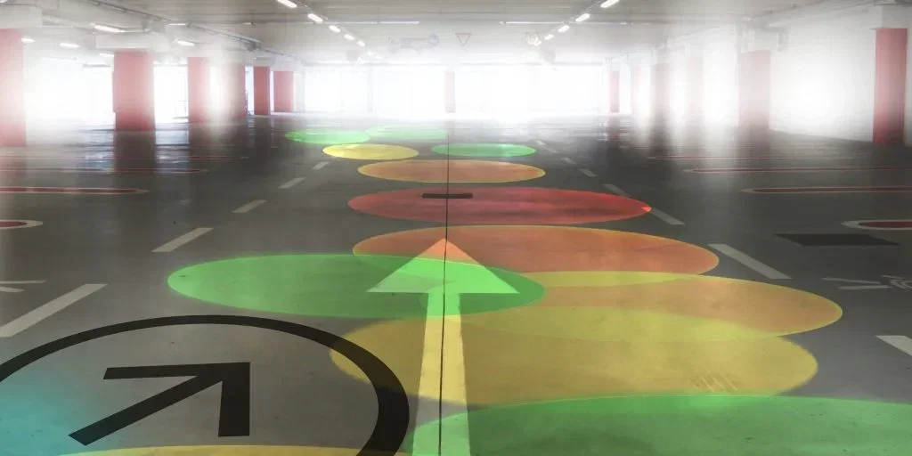
Transit coverage mapping
Identifying dead zones between metro stations so riders can stream uninterrupted.

User Explorer
A customer service rep views the network status in a subscriber's home, pinpointing a known problem area.
Indoor coverage sampling
A car-sharing service resolves vehicle-location failures traced to a parking structure dead zone.

Speed test servers
Marketing confidently claims network leadership, backed by verified real-world data.

Speed test servers
Marketing confidently claims network leadership, backed by verified real-world data.
Research
User Personas
I championed a mixed-methods research practice that ran throughout the project lifecycle rather than front-loading discovery and moving on.

Nickie, 18 · University Student · Field Data Collector
Nickie is social, mobile, and comfortable with technology. During summer break, she works for the carrier as a field surveyor, walking routes, attending events, and carrying the benchmark backpack through areas that need coverage data. She is not a network engineer, and that is the point. If Nickie can run a survey, the tool has achieved its accessibility goal. Her frustrations: confusing technical readouts, heavy gear, and unclear instructions.

James, 56 · Real Estate Agent · Mobile Power User
James lives on his phone and tablet, driving between properties all day. He has noticed that clients increasingly ask about mobile coverage before signing. He does not think about the network until it fails him. He represents the end consumer whose experience the entire system is trying to improve.

Jackie, 27 · Customer Service Representative · Front-Line Analyst
Jackie is technically curious and genuinely wants to help customers resolve issues. She has learned enough about network behaviour to identify where problems originate, but she is limited by the tools available to her. She needs fast, visual, decision-ready data, not raw logs.

Darren, 53 · Wireless Network Analyst · Technical Specialist
Darren has decades of experience, but spends most of his time wrestling with spreadsheets that were not built for spatial analysis. He works long hours and frequently overtime. He wants to spend less time commuting to problem sites and more time with his family. Better visualization tools and remote diagnostics directly improve his quality of life.
The users
Finding the 1%
Instead of generic personas, we created Sasha and Ringo as decision-making tools, a shared shorthand to help align teams around what different users needed and why.
Sasha — Affiliate Manager
Sasha lives in the operational and strategic layer of the platform. She onboards affiliates, monitors campaign performance, manages relationships, and troubleshoots compliance issues. Her work is data-intensive and time-sensitive. Ambiguity in reporting isn't a minor inconvenience. It directly delays her ability to act. She needs clarity, speed, and confidence in the data she's working with.
Ringo — Affiliate
Ringo's relationship with the platform is narrower but no less critical. He tracks clicks, registrations, and commissions to understand what's working and optimise his campaigns. He touches a small subset of the platform, but his expectations for accuracy and transparency are absolute. If reporting is inconsistent or unclear, he doesn't raise a ticket. He starts looking for a platform he trusts more.
Design System
Consistency as a Strategic Asset
With multiple development teams working in parallel across a complex, multi-module platform, design drift was a real risk. I led the creation of a component library built on Kendo UI, establishing a shared foundation that let teams move independently without diverging visually or behaviourally.
The component library did more than maintain visual consistency. It became an alignment tool between design and engineering ,reducing the negotiation overhead on every feature and giving stakeholders a common language for discussing trade-offs.
To manage customisation requests at scale, I introduced a structured decision framework: a flowchart that defined clear criteria for when an existing component could be adapted, when it needed to remain standardised, and when the ROI of a new pattern justified the maintenance cost.
Systems create trust
This shifted stakeholder conversations from opinion to principle — and built trust by demonstrating that design decisions were guided by strategy, not gatekeeping.
Managing Change
Letting users navigate the transition
Redesigning a live platform used for financial workflows demands particular care around change management. We introduced two mechanisms to reduce transition anxiety:
Beta opt-in/opt-out
Users could switch between the new and legacy interfaces at any point. This reduced the fear of being "stranded" in an unfamiliar system and gave the team a real signal about which new patterns users preferred and which needed iteration.
Single Sign-On (SSO)
Affiliates managing multiple programmes across different operator brands previously navigated separate URLs with separate credentials. SSO unified access under a single login, eliminating a recurring source of friction and password-related support requests.
White Labelling at Scale
Accessibility Without Compromise
With over 500 branded operator environments, Income Access faced a challenge unique to white-label platforms: many customers' brand colours failed WCAG contrast requirements, meaning full colour customisation would have introduced systematic accessibility failures.
The solution was a constrained customisation model. Primary and secondary brand colours were applied selectively to navigation areas — where brand expression had the most impact — while the rest of the interface maintained a consistent, accessible baseline. Users got recognisable environments; affiliates got an interface that remained legible regardless of which operator they were working under.
Worklflows
Redesigned web flow
The original flow required new users to make a deposit before they could apply for a card a 33-step process that no single team owned end-to-end.
After removing the first deposit screen and conducting a full task analysis, we identified the redundant steps: unnecessary navigation loops, repeated data entry, and confirmation screens that added friction without adding value.
Streamlining these reduced the flow by approximately 30%.


The revised flow routes users from the sign-up page directly to Strong Customer Authentication (SCA), where they enter their shipping address and generate a security PIN. After SCA and KYC are complete, users land on the dashboard with a contextual marketing banner prompting them to continue their card application — a pragmatic solution given the code freeze constraints.

Once a physical card is shipped (7–10 business days), users return to activate it. In the meantime, virtual prepaid cards are available immediately.

Worklflows
Mobile Interface Design
Adapting the journey for mobile required more than responsive resizing. Touch targets, input flows, and screen-by-screen information hierarchy were reconsidered to suit how users actually interact with their phones in context — not just how the desktop screens scaled down.

The mobile registration and card application flow was prototyped, tested, and refined to match the simplified web flow, with SCA and KYC managed through the Jumio integration.


Outcomes and Impact
Measurable improvements across core dimensions
Performance:
Enhanced responsiveness reduced friction in high-frequency workflows, especially in reporting, where faster access directly increased user confidence.
Usability:
Core workflows, such as affiliate reporting and registration management, became clearer and faster to complete. Cognitive load decreased by highlighting high-impact features and simplifying or deprioritizing less-used areas.
Consistency:
The design system reduced visual and behavioral inconsistencies across modules, making the platform more coherent and trustworthy as users navigated between sections.
Research integration:
The embedded research practice established a continuous feedback loop, allowing the team to identify usability issues early and validate design decisions based on actual user behavior.
Trust:
Enhancements in reporting clarity, interface consistency, and interaction reliability addressed the root causes of affiliate attrition, not just the symptoms.
White Labelling at Scale
Accessibility without compromise
With over 500 branded operator environments, Income Access faced a challenge unique to white-label platforms: many customers' brand colours failed WCAG contrast requirements, meaning full colour customisation would have introduced systematic accessibility failures.
We chose a constrained customization model. Primary and secondary brand colours were used only in navigation areas, where brand expression mattered most. The rest of the interface stayed consistent and accessible. This way, users saw familiar environments, and affiliates always had a clear, readable interface, no matter which operator they worked with.
Reflections
Rebuilding trust
This project reinforced a key principle in complex systems: value is rarely distributed evenly. A small number of workflows drive most engagement, and identifying these through data, rather than intuition, is the most effective way to achieve meaningful impact.
It also challenged a common design instinct: simplifying by removing variability. Income Access was designed as a highly customizable platform. The goal was not to eliminate variability but to make it clear and understandable, so that regardless of a client's configuration, the underlying patterns and logic remained consistent and trustworthy.
Designing during global disruption introduced new constraints. These constraints clarified priorities, leading to better outcomes than an open brief would have allowed.
The result was not a feature-rich platform, but a more trustworthy one. For a system where data influences financial outcomes, trust is the most important result.
Let's work together
What is your next
product?
challenge?
goal?
mission?
product?
challenge?
goal?
mission?
I'm open to collaborations, consulting engagements, speaking invitations, and mentorship conversations. Happy to sign an NDA before we even start.
Work
Fintech & Marketing
Innovation & IoT
Engineering & Energy
Community
©2026 Berumen Design. All rights reserved.