
Income Access
Rebuilding Trust at the Core of a Revenue Platform
THE CHALLENGE
Redesigning a Global Affiliate Marketing Platform and regaining trust
In 2019, Income Access had a problem most software companies dread: it was no longer the platform people chose. Once a pioneer in affiliate marketing analytics, it had accumulated years of technical debt, slow load times, a fragmented interface, and workflows that forced users to work around the tool rather than with it. Affiliates were quietly churning. Managers were filing support tickets instead of making decisions.
The mandate wasn't a facelift. It was a fundamental rethinking of how a revenue-critical platform earns and sustains user trust.
As UX Lead over a 20-month engagement, I shaped the design strategy from research through delivery — working within a live Agile environment where every release had real users, real financial stakes, and no margin for confusion.
Role
User Experience Lead, Agile team.
Strategy
Design Thinking & Product Strategy.
Methodology
Product development framed through a Value Proposition Canvas to align user needs with business objectives.UX for SaaS using Figma, Adobe Illustrator, Pendo, Maze
The Stakes
Why UX Failure Here Means Financial Failure
Income Access goes beyond simply helping people run campaigns; it plays a crucial role in how money flows. Reporting, attribution, and commission payouts directly impact the earnings of affiliates and the acquisition costs for operators. When the interface was confusing, users didn't just feel frustrated; they also lost trust in the data. When affiliates lose trust in the numbers, they tend to leave.
This situation made trust the guiding principle for every design decision. It wasn't about aesthetics or the speed of adding new features; it was all about trust. The system became more reliable by being easier to understand.
Ecosystem Context
A Revenue Multiplier Across Paysafe
What users experienced
- Reporting workflows (the most critical part of the platform) were slow, inconsistent, and difficult to parse
- The interface had grown through accretion, not design: features layered on top of features, navigation logic that differed by section
- Affiliates managing multiple accounts faced repeated logins across different URLs
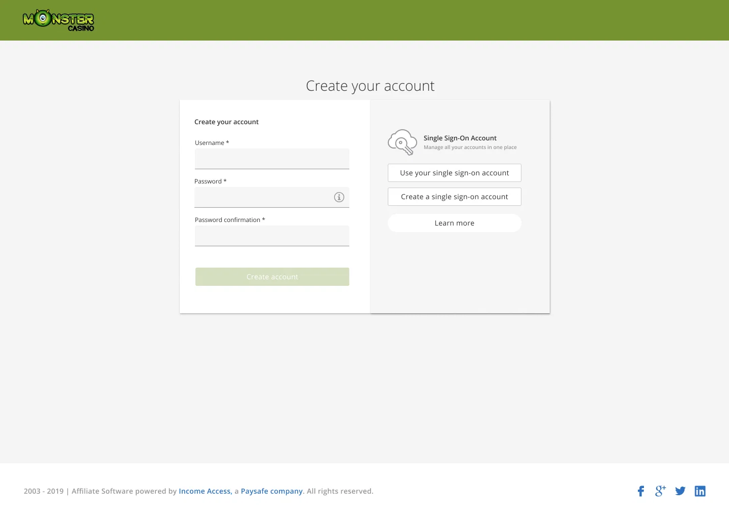
- New affiliates encountered a registration flow that felt like a compliance form, not an onboarding experience
What the business felt
- Rising support and training overhead as users struggled with unintuitive flows
- Affiliate attrition attributed in part to a platform that felt behind modern competitors
- An engineering team hampered by an aging architecture that made new features expensive to build and fragile to maintain
Project Objectives
Fenikkusu - Rebirth
The internal project name — Fenikkusu (Japanese for phoenix) — captured the ambition: not an incremental improvement, but a platform reborn.
Scope
Commissions, ad serving, reporting dashboards, payments, CRM, onboarding, internal tools, and the affiliate registration workflow — a continuous loop where traffic becomes behaviour, behaviour becomes attribution, and attribution becomes financial outcomes.
Three strategic objectives shaped the work:
Technology Modernization
Rebuild the platform's architecture to improve performance, reliability, and scalability, targeting the root causes of slow response times and integration failures.
User Experience Enhancement
Redesign core workflows around how users actually work, reducing friction in the areas that drove the most engagement and trust.
Feature Parity and Innovation
Maintain continuity for existing users while introducing new capabilities, ensuring the transition felt like progress rather than disruption.
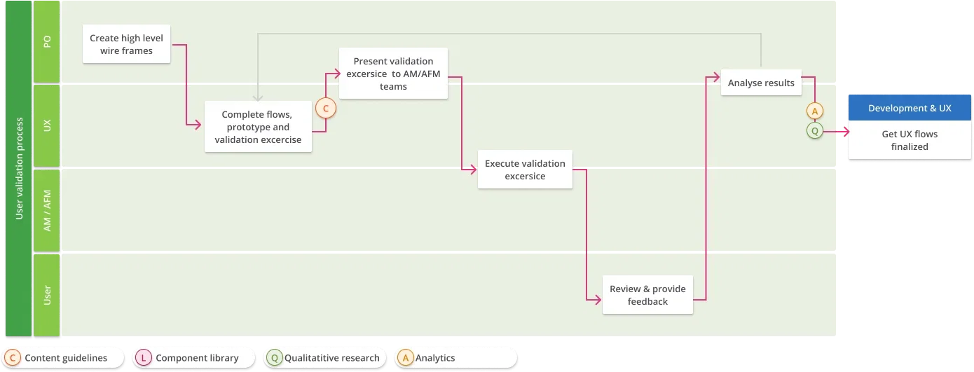
Research
Finding the 1% that matters
I championed a mixed-methods research practice that ran throughout the project lifecycle rather than front-loading discovery and moving on.
Qualitative work
User interviews and usability testing were conducted through Maze. To enhance research capabilities without hindering delivery, I trained customer support agents to perform lightweight usability tests during their scheduled client calls, transforming routine interactions into a continuous feedback channel.
Quantitative work
Behavioural analytics via Pendo revealed a pattern that fundamentally changed our approach.
- For affiliates, 1% of features drove 80% of interactions.
- For affiliate managers, 5% of features accounted for the same level of usage, 80%.
Clear implications
The platform's complexity was mostly hidden from its users. This was not because they lacked features, but rather because a limited set of workflows, primarily reporting for affiliates and registration management for affiliate managers, was performing the essential tasks.
Further path analysis showed that many low-usage areas suffered from usability barriers rather than a lack of user intent. Advanced users had already abandoned parts of the interface in favour of automated workarounds outside the platform.
On the affiliate manager side, a 63% retention rate indicated the platform was reliably delivering core value, which shifted the design priority from adding capabilities to improving the experience of the capabilities that already mattered.
Our users
A common language across the organization
Instead of generic personas, we created Sasha and Ringo as decision-making tools, a shared shorthand to help align teams around what different users needed and why.

Sasha — Affiliate Manager
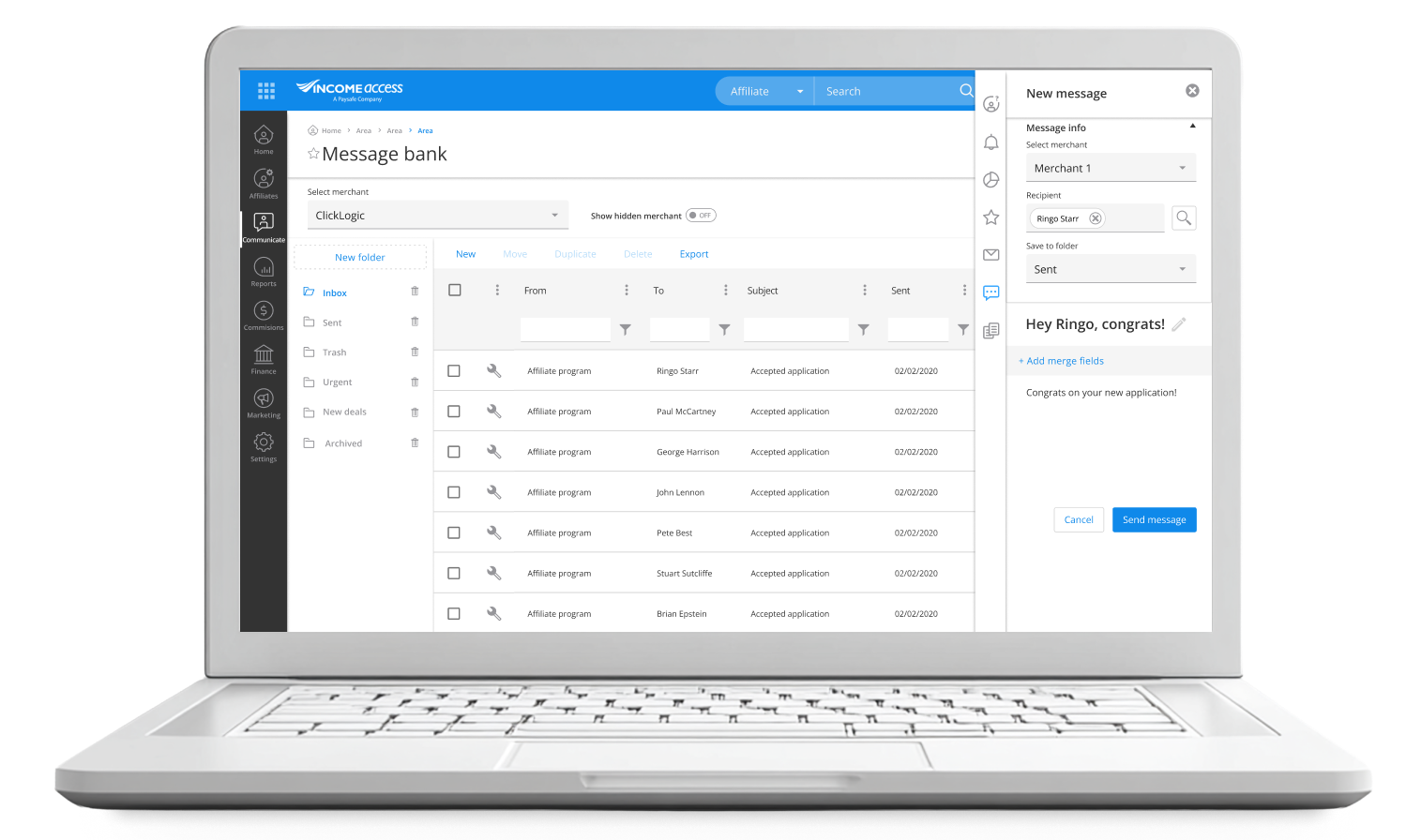
Sasha lives in the operational and strategic layer of the platform. She onboards affiliates, monitors campaign performance, manages relationships, and troubleshoots compliance issues. Her work is data-intensive and time-sensitive. Ambiguity in reporting isn't a minor inconvenience. It directly delays her ability to act. She needs clarity, speed, and confidence in the data she's working with.

Ringo — Affiliate
Ringo's relationship with the platform is narrower but no less critical. He tracks clicks, registrations, and commissions to understand what's working and optimise his campaigns. He touches a small subset of the platform, but his expectations for accuracy and transparency are absolute. If reporting is inconsistent or unclear, he doesn't raise a ticket. He starts looking for a platform he trusts more.
Design System
Alignment as a Strategic Asset
With multiple development teams working in parallel across a complex, multi-module platform, design drift was a real risk. I led the creation of a component library built on Kendo UI, establishing a shared foundation that let teams move independently without diverging visually or behaviourally.
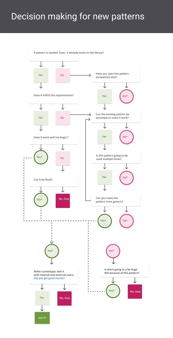
The component library did more than maintain visual consistency. It became an alignment tool between design and engineering ,reducing the negotiation overhead on every feature and giving stakeholders a common language for discussing trade-offs.
To manage customisation requests at scale, I introduced a structured decision framework: a flowchart that defined clear criteria for when an existing component could be adapted, when it needed to remain standardised, and when the ROI of a new pattern justified the maintenance cost.
Systems create trust
This shifted stakeholder conversations from opinion to principle and built trust by demonstrating that design decisions were guided by strategy rather than gatekeeping.
Managing Change
Letting users navigate the transition
Redesigning a live platform used for financial workflows demands particular care around change management. We introduced two mechanisms to reduce transition anxiety:
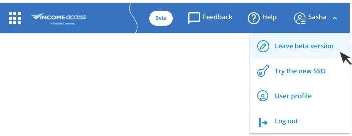
Beta opt-in/opt-out
Users could switch between the new and legacy interfaces at any point. This reduced the fear of being "stranded" in an unfamiliar system and gave the team a real signal about which new patterns users preferred and which needed iteration.
Single Sign-On (SSO)
Affiliates managing multiple programmes across different operator brands previously navigated separate URLs with separate credentials. SSO unified access under a single login, eliminating a recurring source of friction and password-related support requests.
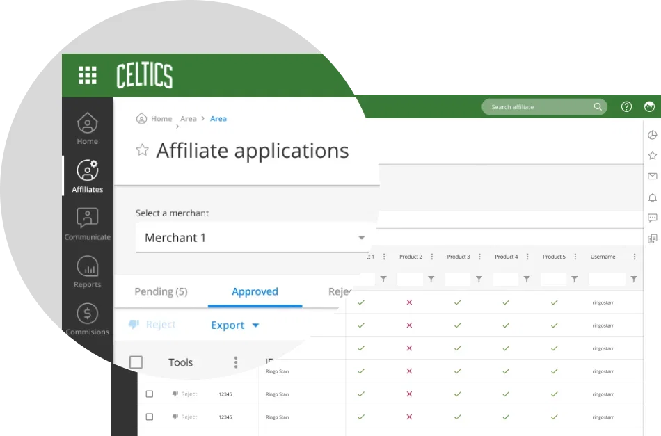
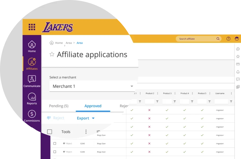
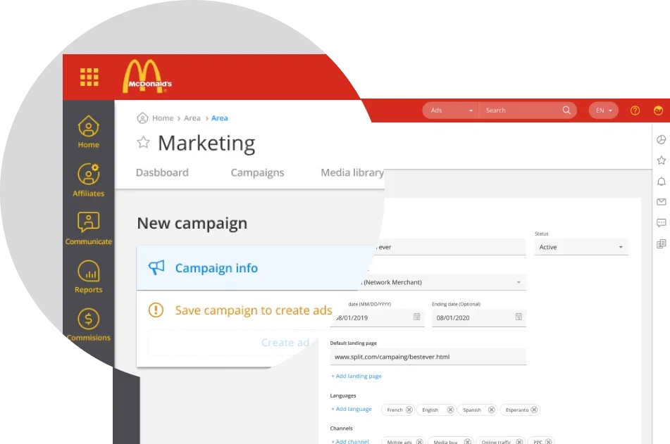
White Labelling at Scale
Accessibility Without Compromise
With over 500 branded operator environments, Income Access faced a challenge unique to white-label platforms: many customers' brand colours failed WCAG contrast requirements, meaning full colour customisation would have introduced systematic accessibility failures.
The solution was a constrained customization model.
Primary and secondary brand colours were applied selectively to navigation areas, where brand expression had the greatest impact, while the rest of the interface maintained a consistent, accessible baseline. Users received recognizable environments; affiliates received an interface that remained legible regardless of the operator they were working under.
Outcomes and Impact
Measurable improvements across core dimensions
Performance:
Enhanced responsiveness reduced friction in high-frequency workflows, especially in reporting, where faster access directly increased user confidence.
Usability:
Core workflows, such as affiliate reporting and registration management, became clearer and faster to complete. Cognitive load decreased by highlighting high-impact features and simplifying or deprioritizing less-used areas.
Consistency:
The design system reduced visual and behavioral inconsistencies across modules, making the platform more coherent and trustworthy as users navigated between sections.
Research integration:
The embedded research practice established a continuous feedback loop, allowing the team to identify usability issues early and validate design decisions based on actual user behavior.
Trust:
Enhancements in reporting clarity, interface consistency, and interaction reliability addressed the root causes of affiliate attrition, not just the symptoms.
Reflections
Rebuilding trust
This project reinforced a key principle in complex systems: value is rarely distributed evenly. A small number of workflows drive most engagement, and identifying these through data, rather than intuition, is the most effective way to achieve meaningful impact.
It also challenged a common design instinct: simplifying by removing variability. Income Access was designed as a highly customizable platform. The goal was not to eliminate variability but to make it clear and understandable, so that regardless of a client's configuration, the underlying patterns and logic remained consistent and trustworthy.
Designing during global disruption introduced new constraints. These constraints clarified priorities, leading to better outcomes than an open brief would have allowed.
The result was not a feature-rich platform, but a more trustworthy one. For a system where data influences financial outcomes, trust is the most important result.
Let's work together
What is your next
product?
challenge?
goal?
mission?
product?
challenge?
goal?
mission?
I'm open to collaborations, consulting engagements, speaking invitations, and mentorship conversations. Happy to sign an NDA before we even start.
Work
Fintech & Marketing
Innovation & IoT
Engineering & Energy
Community
©2026 Berumen Design. All rights reserved.