Redesigning a Global Affiliate Marketing Platform
Income Access has been a leading force in affiliate marketing analytics and technology since its inception in 2002. However, with the rapidly evolving digital landscape, the platform faced several challenges such as limited data analytics capabilities, suboptimal user experience, and a lack of adaptability to the varied needs of digital marketing. To address these issues, the project embarked on a mission to redefine the software's capabilities and expand its reach in the digital marketing domain.
As UX Lead, UX Design played a crucial role in shaping the software's evolution, emphasizing a user-centred approach targeting users' needs and pain points. We started with a detailed analysis of user interactions and expectations to inform a redesign aimed at improving the interface, data processing, reporting, and introducing customization to set a new standard in digital marketing tools.
This was not a surface-level redesign. It was a systemic effort that reshaped how value is tracked, interpreted, and distributed across a multi-sided ecosystem of affiliates and operators.
The work took place in a live environment with active users, continuous releases, and tightly coupled systems. Every decision carried implications for usability, trust, and revenue.
Design Thinking & Product Strategy
20 months duration
Figma, Adobe Illustrator, Pendo and Maze
User Experience Lead in Agile team
Income Access operates as a system where data directly influences financial outcomes. Reporting, attribution, and payments are not mechanisms that define how value is distributed across multiple partnerships. This makes trust a central component of the user experience.
As a result, trust was the main driver of all our efforts and was reinforced through consistency and transparency. The system became more reliable because it was easier to understand.
Behavioural data revealed that a small percentage of features accounted for the majority of user activity. Reporting for affiliates and registration for affiliate managers emerged as the most critical workflows. High-impact workflows were surfaced more clearly, while less critical features were simplified or deprioritized. The platform became more efficient and easier to navigate, reducing friction in the areas that mattered most.
With multiple teams working in parallel, consistency was vital for scalability. A component library offered a shared design base, aligning teams while preserving flexibility. This enabled new features to be developed and integrated smoothly, reducing ambiguity between design and engineering. Ultimately, it created a platform that evolved efficiently and remained coherent.
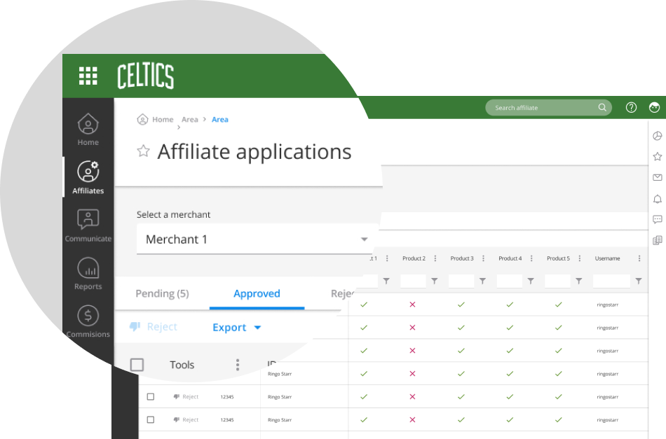
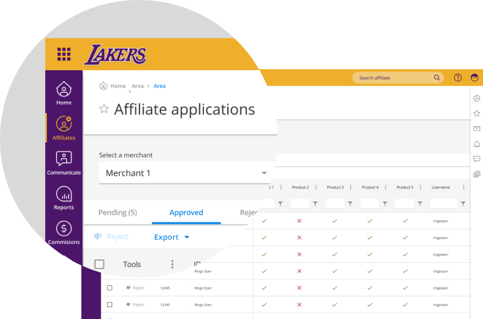
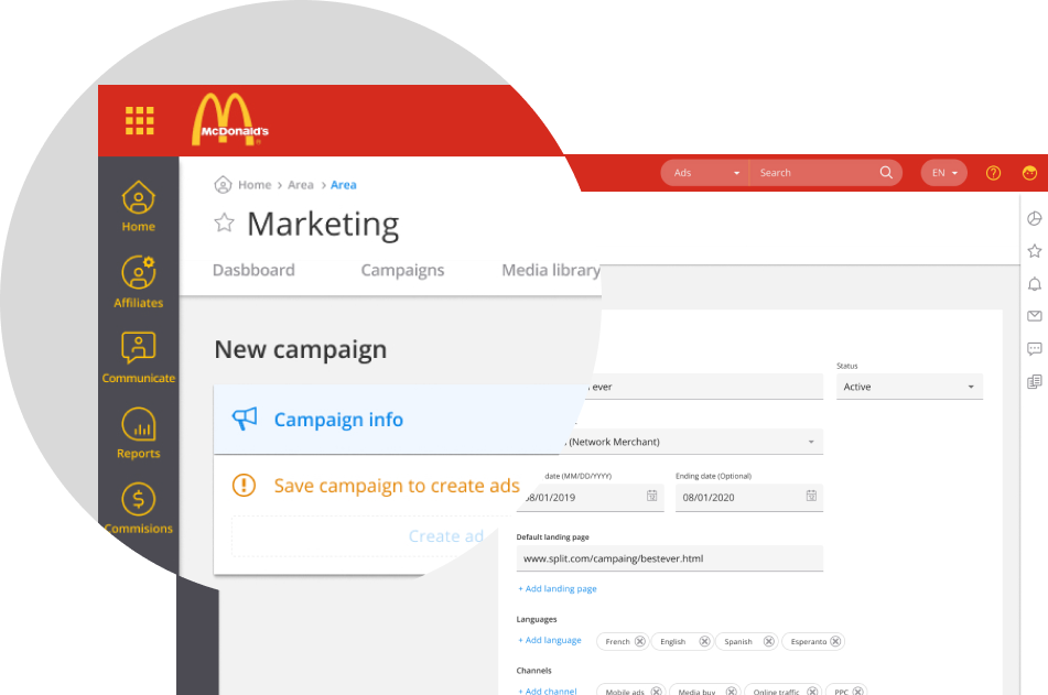
The platform’s customizable navigation shifted from fixed to flexible systems, allowing customers to create their own configurations. By emphasizing consistent patterns and visual logic, we built a navigation system that stayed usable regardless of setup. Users could adapt while understanding the organization. This approach supported diverse customer needs without losing usability.
Research was integrated into the product lifecycle. Usability testing via Maze and behavioural tracking with Pendo offered complementary user insights. This mixed-methods approach enabled the platform to evolve based on real user behaviour, boosting confidence in design choices and overall quality.
Income Access operated as part of a broader ecosystem within Paysafe, where affiliate marketing directly contributed to the growth of digital payment flows. Affiliates acted as a primary acquisition channel, bringing users into operator platforms such as casinos, sportsbooks, and trading environments.
Once inside these platforms, users engaged in financial transactions, often facilitated through digital wallets and payment solutions connected to the same ecosystem. This created a direct relationship between affiliate performance and transaction volume. The effectiveness of the affiliate network influenced not only user acquisition, but also the flow of money through Paysafe’s infrastructure.
The Income Access software struggled due to outdated technology and technical debt from poor architectural choices and lack of investment. Its once user-friendly interface became cumbersome, alienating users who sought more streamlined, visually pleasing digital experiences. As new internet traffic tracking methods emerged, its user base gradually shrank in favor of modern solutions with advanced technology and engaging user experience.
Technology Modernization
Actively upgrading the software’s architecture to incorporate advanced technologies, aiming to enhance performance and scalability.
User Experience Enhancement
Implementing a comprehensive UI redesign to ensure intuitive navigation and improved usability. Boosts user engagement and satisfaction, aligning the software with contemporary UX best practices.
Feature Parity and Innovation Strategy
Maintain a careful balance between preserving essential features and introducing new functionalities. Ensure users remain comfortable with the software as it adapts to modern design trends and changing user needs.
The redesign spanned commissions, ad serving, reporting dashboards, payments, CRM, onboarding, internal tools, and the affiliate registration workflow. These systems formed a continuous loop where traffic becomes behavior, behavior becomes attribution, and attribution becomes financial outcomes.
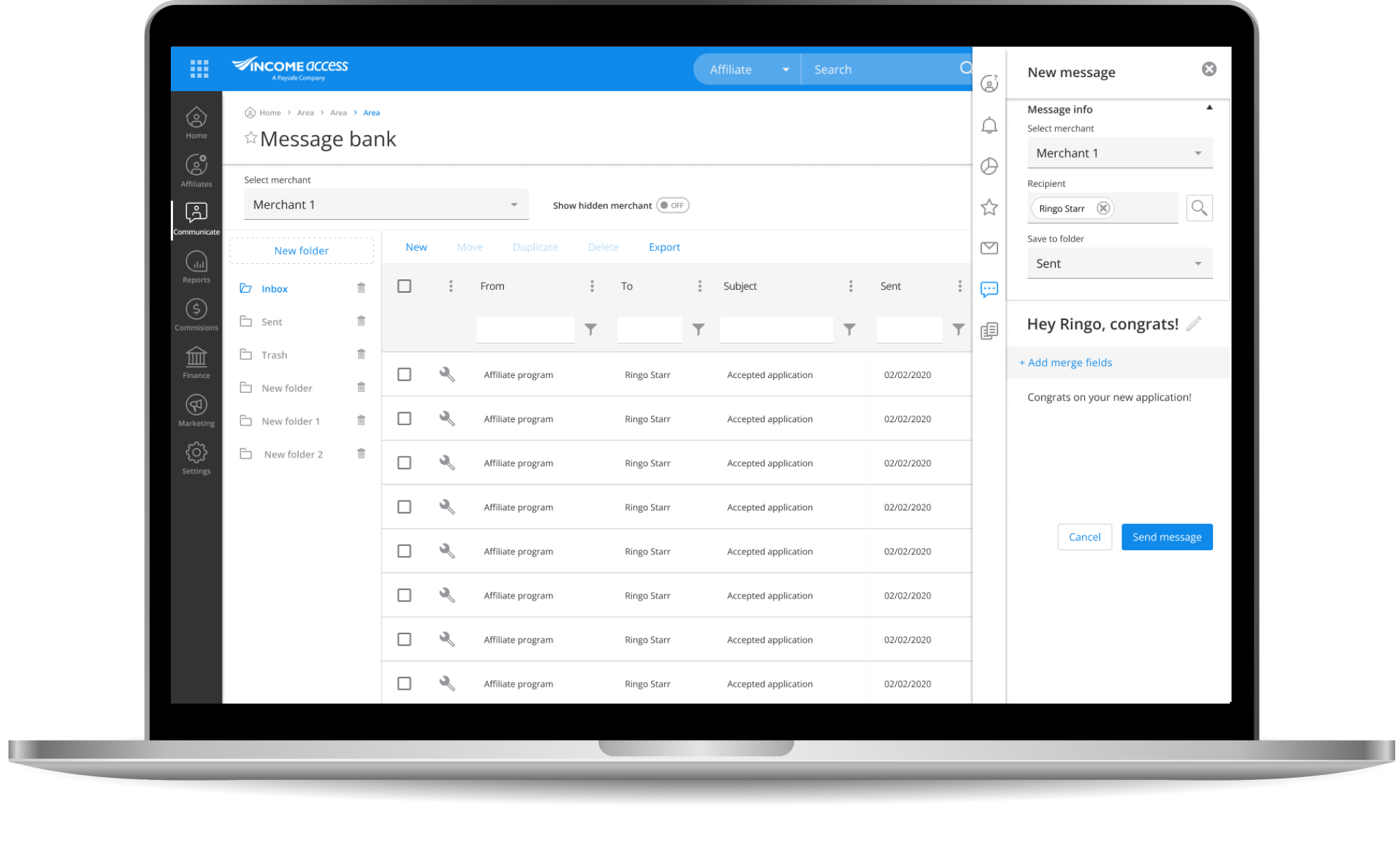
The affiliate registration workflow was a critical entry point. It had to handle multi-step validation and compliance requirements while remaining intuitive, as it shaped the first impression and trust in the platform. At the same time, reporting emerged as the most critical experience for affiliates, becoming the primary lens through which they evaluated performance and earnings.
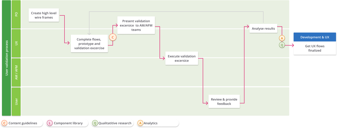
As Design Lead, I chapioned introduction of qualitative and quantitative research to guide decisions. We conducted interviews and usability testing using Maze, and extended research capacity by training customer support agents to run usability tests during their scheduled client calls. This created a continuous feedback loop grounded in real usage.
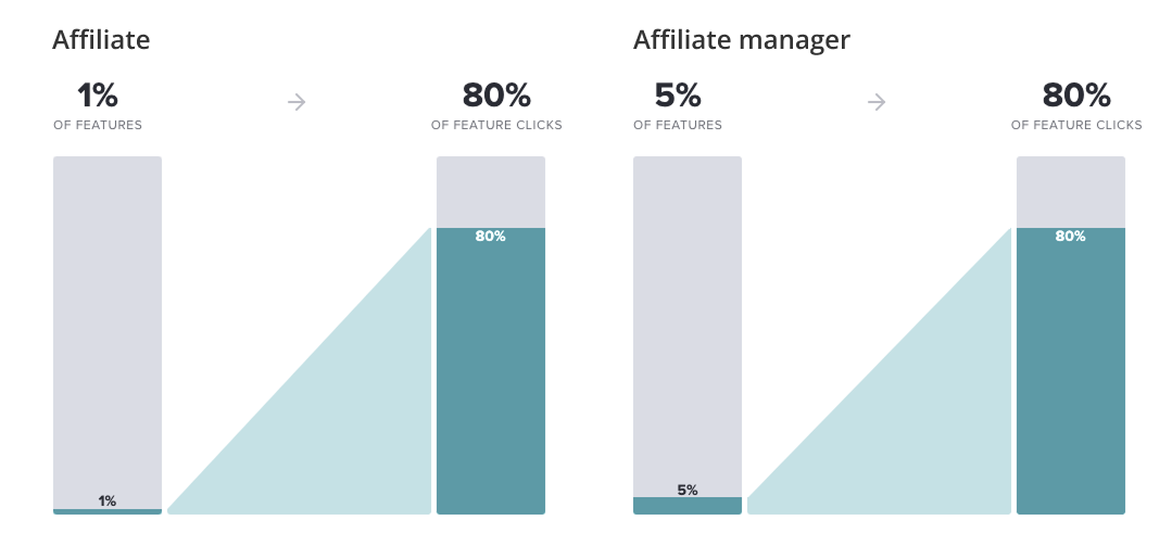
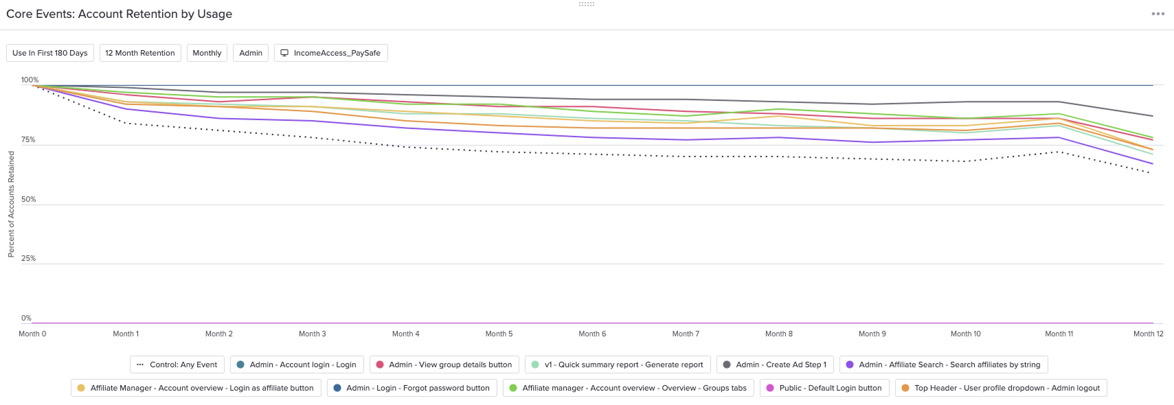
Using Pendo, we uncovered behavioral patterns that reshaped the design strategy. Feature usage was highly concentrated. For affiliates, 1% of features drove 80% of interactions, while for affiliate managers, 5% accounted for the same level of usage.
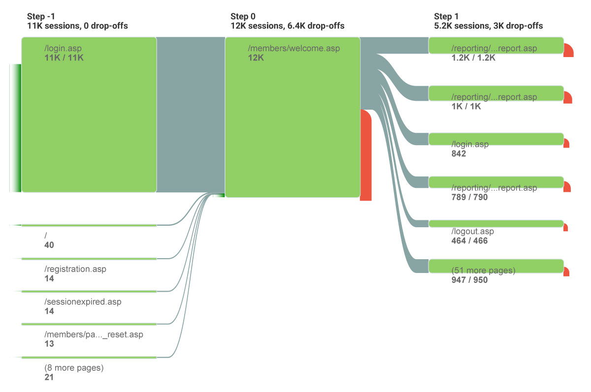
Further analysis revealed that reporting was the most heavily used area for affiliates after the dashboard. At the same time, low usage in other areas was explained by two factors. Some features suffered from usability issues that prevented engagement, while advanced users had already transitioned to automated workflows outside the interface.
On the affiliate manager side, we observed a 63% retention rate, indicating that while usage was concentrated, the platform was delivering consistent value in its core areas. These insights shifted the design approach. Instead of expanding functionality, we focused on improving usability in underperforming areas while strengthening and prioritizing the workflows that drove the majority of engagement.
To support multiple teams working in parallel, I led the creation of a component library based on Kendo UI. This provided a shared foundation for interface design, ensuring consistency across the platform while enabling teams to move independently.
The design system became a key alignment tool, reducing ambiguity and maintaining coherence as new features were introduced.
To manage customization at scale, we introduced a systematic approach to decide when components could be adapted and when they needed to remain standardized. Without this, requests were often driven by preference, risking inconsistency and higher maintenance. By defining clear criteria based on impact, such as core workflows and accessibility, we created a shared framework for decision-making.
This shifted conversations from opinion to principle, helping stakeholders understand trade-offs between flexibility and consistency. It also built trust by showing that customization was guided by strategy, not restriction.
We created personas like Sasha and Ringo as shared shorthand to align teams quickly around user needs, behaviors, and decision-making contexts.

Operates at the center of the platform’s operational and strategic workflows. She is responsible for onboarding affiliates, managing relationships, monitoring performance, and ensuring that campaigns drive measurable results. Her work is data-intensive and requires constant interaction with reporting, registration, and configuration tools. For her, efficiency and clarity are critical. She needs to quickly understand performance trends, take action on underperforming partners, and ensure that new affiliates are properly set up. Any friction in workflows or ambiguity in data directly impacts her ability to make timely and informed decisions.

His primary goal is to drive traffic and conversions while clearly understanding how those efforts translate into earnings. He relies heavily on reporting to track clicks, registrations, and commissions, using this data to optimize his strategies. Unlike the Affiliate Manager, Ringo interacts with a smaller subset of the platform, but expects high accuracy and transparency in those areas. Trust is critical for him. If reporting is unclear or inconsistent, it directly affects his confidence in the platform and his willingness to continue investing effort into it.
To support a smooth transition during the redesign, we allowed users to return to previous versions of the interface when possible. This reduced friction and anxiety around change, especially in a system tied to critical workflows and financial outcomes. It also gave users time to adapt at their own pace while providing the team with valuable feedback during the rollout.
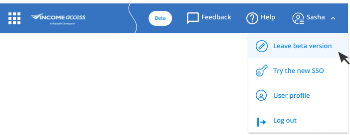
Switch so users can try beta versions and get used to new features without interruptions.
Single sign-on allowed users with multiple accounts to switch seamlessly without leaving the platform, reducing friction across workflows while also minimizing password-related issues.
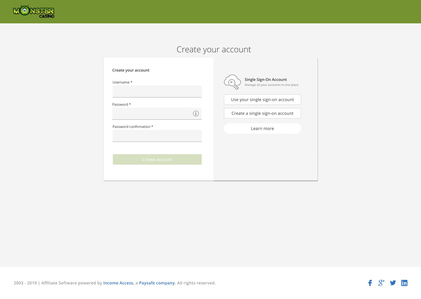
Single Sign-On (SSO) is an authentication process allowing you to access all affiliate programmes powered by Income Access through one login credential, so users do not switch between numerous URLs to access all the different platforms.
Benefits
Single Sign-On (SSO) is an authentication process allowing you to access all affiliate programmes powered by Income Access through one login credential, so users do not switch between numerous URLs to access all the different platforms.
Benefits
White labelling at the scale of Income Access introduced significant challenges. With over 500 brands, many used colors that did not meet WCAG contrast requirements, impacting accessibility. Instead of full customization, we balanced brand expression and usability by applying primary and secondary brand colors to navigation areas, while keeping the rest of the interface consistent and accessible.
The redesign improved performance and responsiveness, reduced inconsistencies across workflows, and made navigation more intuitive despite its variability. By focusing on high-impact areas, we reduced cognitive load and improved efficiency in the tasks users relied on most.
The integration of research and analytics created a continuous feedback loop, allowing the platform to evolve based on real behaviour. Improvements in usability helped surface underutilized features, while core workflows became clearer and more effective.
Most importantly, the work strengthened trust in the platform by improving clarity in reporting, consistency across systems, and reliability in user interactions.
This project reinforced that in complex systems, value is not evenly distributed. A small number of workflows often drive the majority of engagement, and identifying those areas is critical to creating meaningful impact.
It also highlighted that variability, such as customizable navigation, is not always something to eliminate. When designed properly, it can become a strength rather than a limitation.
Designing during a period of global disruption required adaptability, but it also created clarity. Constraints forced prioritization, and prioritization led to better outcomes.
In the end, the redesign was not about adding more features, but about making the system work better where it mattered most.
Versatility, tech leadership, and innovation across industries.
idea.
concept.
startup.
dream.
goal.
Feel free to reach out and share your innovative ideas. I'm always open to collaboration and can sign NDAs to safeguard our discussions and your unique concepts.
©2026 Berumen Design, All rights reserved.
